
Text Widget
 |
 |
 |
The text widget is a passive widget. It displays a numeric value with one decimal place. It provides a choice of border style and color as well as up to three background colors. A label can be specified. If present, it will be scaled to approximately the same text height as the numeric value, and positioned to the left of the text widget.
By default, the text widget's border color is not set, and the color is determined by whether or not the text widget is successfully receiving data; the border is green when the data is being received correctly and red if not. You can override this feature by setting a border color for the text widget.
In addition to the five required parameters, a text widget has eight optional parameters:
| Parameter | Value in Example | Description | If Not Present | Default |
|---|---|---|---|---|
| Color 1 | lightgrey | First color. Background color if additional colors are not specified | Transparent | Yellow |
| Border Style | solid | Can be any CSS border style, except 'Inset', which has special meaning for the 'Set' widget | No border | Solid |
| Border Color | black | Border color | Black | None |
| Color Boundary 1 | 5 | Boundary value between displaying color 1 and color 2 | Use color 1 | 33 |
| Color 2 | yellow | Second color | Use color 1 | Green |
| Color Boundary 2 | 10 | Boundary value between displaying color 2 and color 3. | Use color 1 (or 2 if present) | 66 |
| Color 3 | green | Third color | Use color 1 (or 2 if present) | Red |
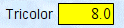
| Label Text | Tricolor | Label text to be displayed to left of widget | No label | Text |